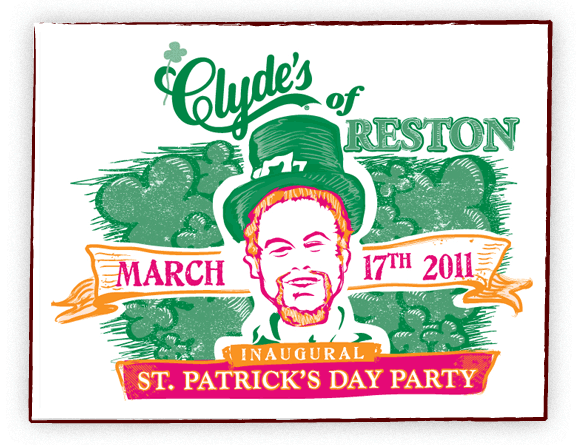
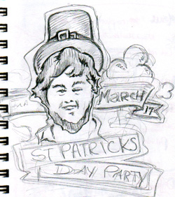
Clyde’s of Reston was having their first St. Patrick’s Day Party. They wanted leprechauns running through the Reston Town Center. All participants received a Tshirt. I had creative freedom to come up with something fun, a rare opportunity! I designed a rough sketch with a more generic leprechaun and just jumped into Illustrator from there.

After an initial draft, Clyde’s asked if I could make the leprechaun look a little like the Manager at Reston. So we made tweaks and here is the final shirt!

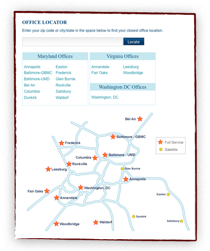
Shady Grove Fertility needed a zip code locator to integrate into their existing Drupal site. We created a Drupal module for the zip code locator and incorporated it into their Locations page. The final version of the zip code locator loads all latitude and longitude combination’s for a specific US zip code, and with a mySQL function it calculates for displaying accurate driving distances. The locator also utilizes the Google API.

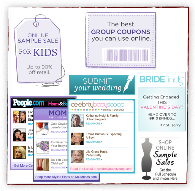
These are various icons and banners I created for MOMfinds and BRIDEfinds. There are kids sales icon for MOMfinds.com, group coupon icon for MOMfinds.com, BRIDEfinds icons and banners, RSS feeds subscribers, MOMfinds.com and Celebrity Baby Scoop icons and banners, RSS feeds for subscribers from People.com, MOMfinds.com and Celebrity Baby Scoop.

I had the chance to work with Bob Hynes on an exhibit in one of the world’s most visited museums! Friday is the official opening of the new Barron Hilton Pioneers of Flight Gallery. It was a lot of fun to visit the Smithsonian during the production and see the various people and tasks that go into making such a large exhibit.

I have not gotten to see the final exhibit yet but hope to soon. I’ll add pictures of the final exhibit after I visit.

My role for Bob’s exhibit pieces was Photoshop work. We needed to take old photos and make them museum worthy. Here is one of the larger pieces.

I started with this original photo:
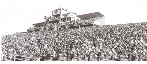
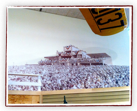
We needed the photo to be a huge stadium scene that spanned a whole wall of the exhibit. Also we added a touch of color. After many hours in Photoshop I was able to create this:

And here it is up on the exhibit wall:
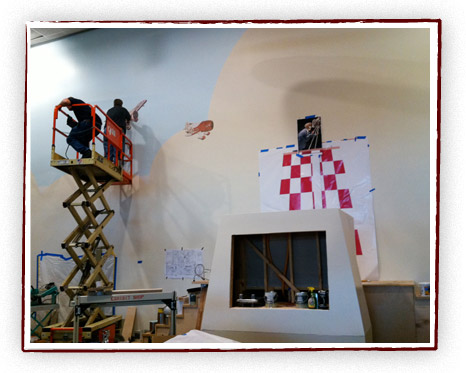
We had smaller pieces such as some planes for the wall:
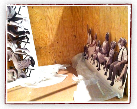
Even more fun, a photo of my family is actually in the exhibit! We needed extra models to dress up in period gear and pretend to be watching an air show. So if you get the chance to see the exhibit, you’ll see the Harners sitting above your heads, behind a white fence, watching an air show.

I put the photos together in Photoshop into a realistic row:

And here we are, prior to getting put in the exhibit.
BRIDEfinds.com is coming soon. As they are building their website, they needed some identity icons to match they style of their sister sites – SHEfinds.com and MOMfinds.com. The challenge of icons is that they need to be able to read well in a smaller size. We came up with these three vector illustrations.

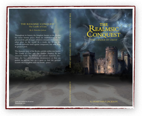
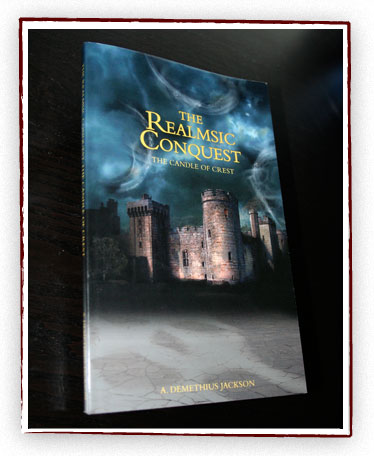
A. Demethius Jackson needed a cover for his first book. He had an idea of a castle being illuminated in darkness with three swirls of magic in the sky. Also in the one window is a faint candle flame. I created this book cover in Photoshop, using a collage of photos, brushes, and some harsh lights/contrast. This was a fun project, I’d love to design more book jackets.

The book is being sold on Amazon and Barnes and Noble.

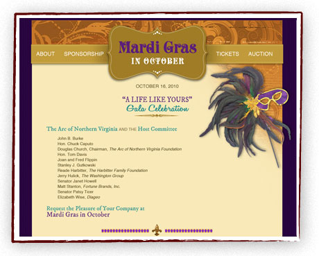
The ARC of Northern Virginia needed a small website for their upcoming Fundraiser done quickly. We stepped in to create an appealing website to match their existing print materials. Users needed to purchase tickets to the event through the website, so we used a basic PayPal solution. We created this website in 3 days time!

We hope we were able to help ARC of NoVA with their fundraising.

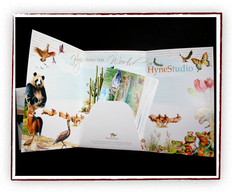
Super talented illustrator Bob Hynes needed a direct mail piece to showcase his work. We decided on a tri-fold brochure/folder format, to be mailed in a matching envelope. On the center inside panel, we made a piece to look similar to a business card that holds in a collection of take-out postcards. The postcards could be swapped in and out to be customized to the recipient. We used the outer panels to show off some of his favorite pieces and built a collage on the inside. I wanted to create a vision of his “world” when you open it up. I thought this piece came out playful and fun but yet professional.

You can see some of Bob’s amazing illustrations here.