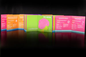
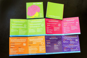
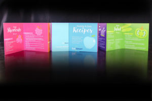
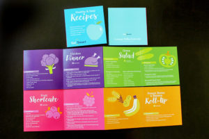
I’m so excited to see the final printed product after working on these two booklets over the winter for this collaborative effort between CMU and WVU. These are both 8-panel accordion-folded booklets, to be handed out with research studies to teenage girls. The top one is a reference guide showing all the various birth control options available and it was important to me that it feel designed with them in mind. The accordion fold was chosen so that the girls could compare and contrast the various options easily. I tried to make the information very simple, and we created a coding system at the bottom with the different types of birth control. The second piece includes healthy recipes that are shown in an accompanying video and are part of an Eat Smart initiative. The pieces were actually printed locally here in Hagerstown by HBP, Inc.

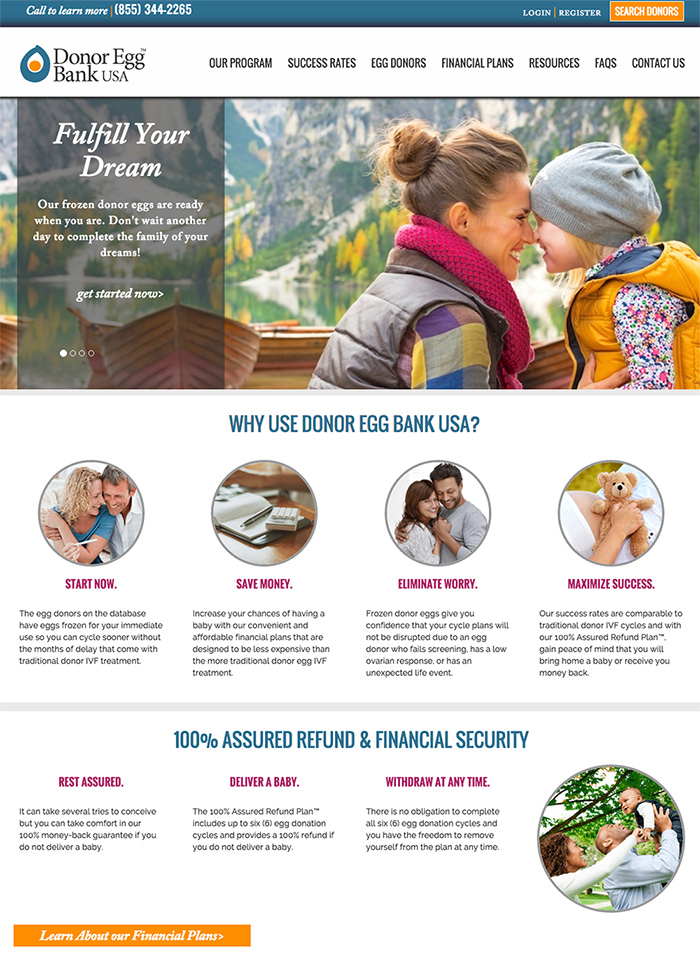
 Old site
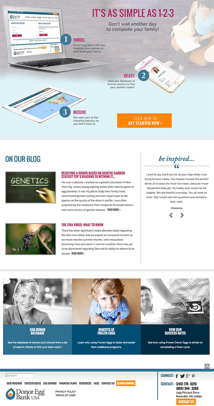