A fun request! A local luau-themed party needed a t-shirt for their 5k run. The dead cow aspect is a long and twisted story but makes for a great t-shirt!
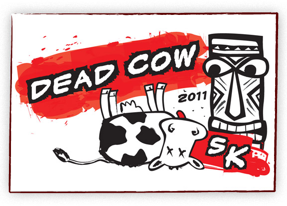
A fun request! A local luau-themed party needed a t-shirt for their 5k run. The dead cow aspect is a long and twisted story but makes for a great t-shirt!

Check out the awesome custom Django gallery Dejan and Vasil created. The gallery allows the user to upload a story and image and each visit to the gallery, or refresh, changes the content.
Visit it live!
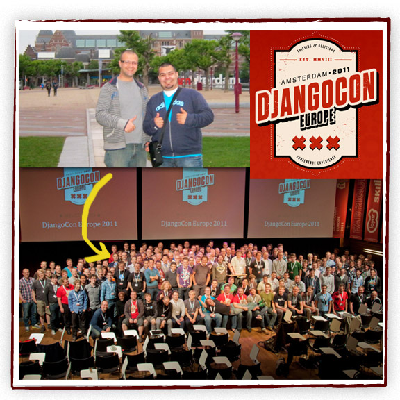
Vasil and Dejan, our amazing developers went to DjangoCon Europe 2011 in Amsterdam in June. A full week of Django talking and learning.
Here is the final logo design for a local organization. It is aimed for an older audience and the clarity of the type was very important to the client. The type all had to be fairly large and easy to read. Also we went with conservative colors to appeal to the target audience.
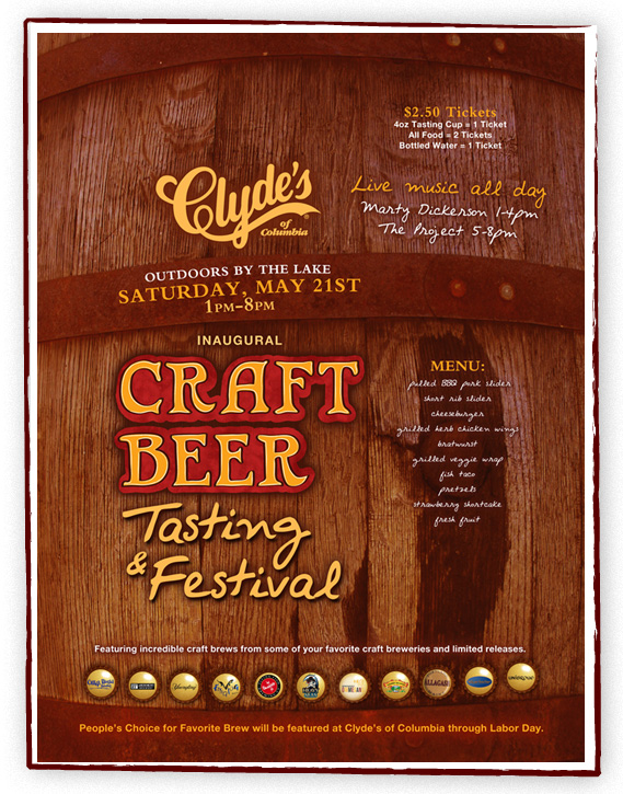
Clyde’s had a new beer festival coming up and I had creative freedom to come up with a design. Since the festival is featuring smaller breweries, I wanted it to feel handmade. I decided to draw the Craft Beer type instead of using a regular font to give it that handmade feel. I took a photo of a local rain barrel and used that for the background to give it an earthy feel. I incorporated the featured breweries on bottle caps. This is a large 20″ x 30″ poster. We made a few smaller pieces to complement the poster.
Here is a simple and clean WordPress website for a beautiful rental property in St. Thomas. The client wanted the gorgeous photos of the house and area to be the focal point and draw the viewer in.
You can view the live site here.

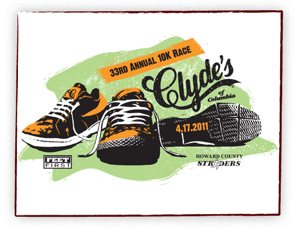
Another fun project. Clyde’s of Columbia has an annual 10K Race and needed a shirt design. I thought it would be fun to have a small collection of running shoes with a bit of old school feel. The final shirt was a nice white athletic running shirt.
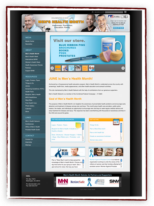
Mid-April we launched a redesign for Men’s Health Month. This is a large website with a lot of information so we restructured the menu and tried to make it easy to navigate. We wanted the design to appeal to men. This is actually a WordPress website with some custom features. You can view the new website HERE.
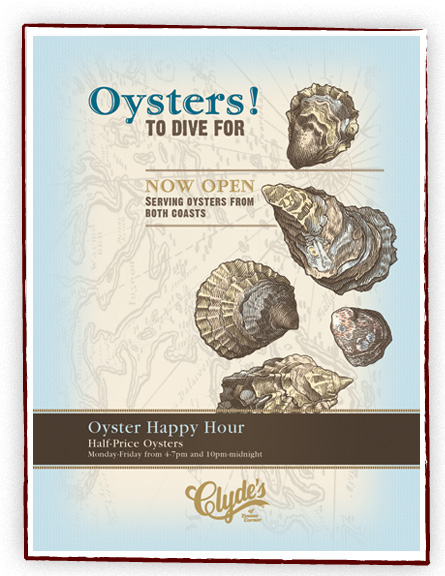
Here is a poster I designed for Clyde’s of Tysons Corner. They started serving oysters and wanted artwork to highlight their newest addition. Oyster lined artwork was given to me by Clydes, I simply colored the shells. I wanted the design to be classy, a little vintage, and fun.
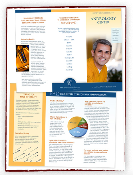
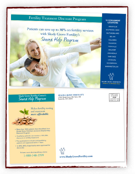
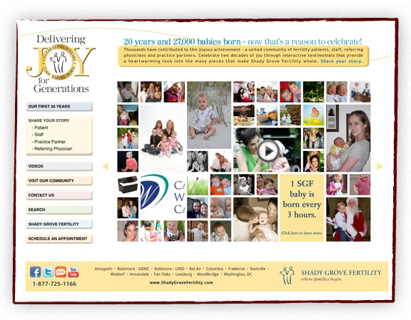
Here are a few pieces from one of our newer clients, Shady Grove Fertility. They have existing branding, but we tried to update the look with subtle tweaks. We started with a redesign of one of their trifold brochures and then designed a postcard.
