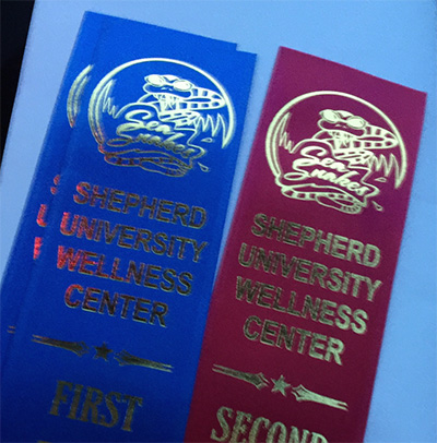
The Shepherd University’s Wellness Center started up a new competitive swim team for kids and teens this year and needed a new logo. During my research I discovered that the sea snake is actually quite deadly. I used Shepherd’s color scheme, Shepherd Wellness Center’s font tweaked just a little bit to be a tad prettier into the logo with ‘Sea Snakes’ and worked up a nifty logo for the new swim team to hopefully be proud of.


And as an update, the logo has been working out really well across various formats including spiffy ribbons as the team grows. Go Sea Snakes!


