A website redesign.
Our first project with this great client was a website redesign for Donor Egg Bank USA. We aimed for a fresh, modern look that appealed to their audience: tech-savvy women in the 30-40 range. The client wanted what is an overwhelming and sensitive subject to feel managable and simple.
While designing this website, we made sure it would look great on tablets and mobile devices.
This project took our developer, Vasil Vangelovski and his freelance team a year to develop. He did an amazing job, as there were a large amount of broken databases in the back-end that did not connect together. While my design was fairly easy for his team to develop, Vasil had to create a new, secure database system for egg donors across the US, that allows users to search and really protect the back-end users privacy. In addition, it allows for growth as new egg banks are added.


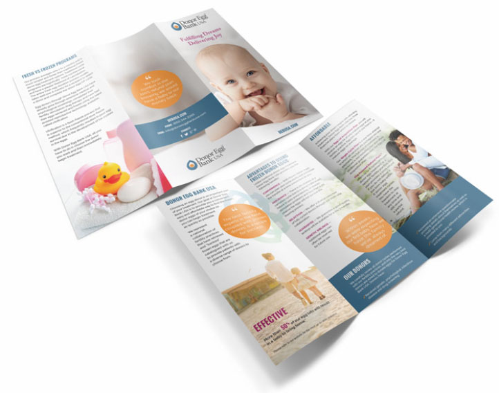
A brochure to match.
Once the website design was decided upon, the client wanted to have a trifold brochure designed that matched the new overall fresh feel. Since designing this trifold, we have created a version in Spanish and versions for partnering egg banks with thier own branding and information included within a panel on the brochure.
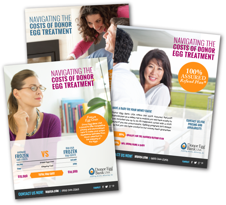
Fact sheets.
The client wanted to hand out some targeted information that answers common questions or concerns that they receive. We developed three engaging fact sheets to present this information.


One more website.
The Frozen Egg Bank Network works together with Donor Egg Bank to help women with reproductive health concerns and they were also in need of a website. This website had similar challenges and approaches as the first website but it is marketed towards a slightly younger demographic of women.


