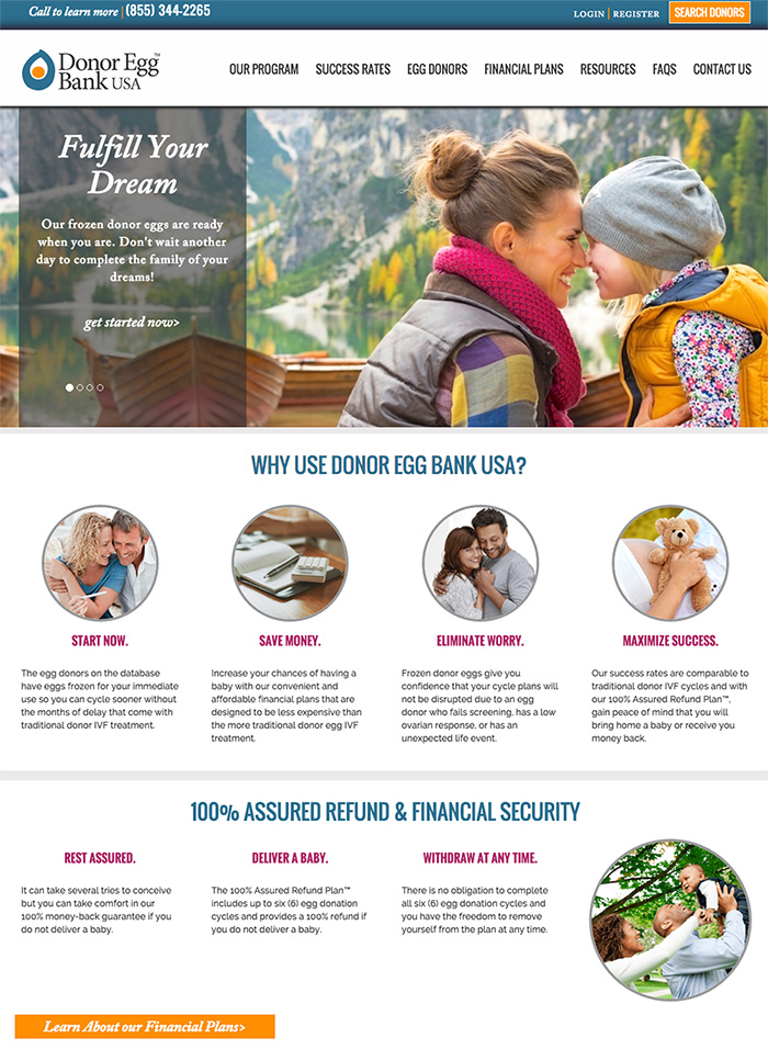
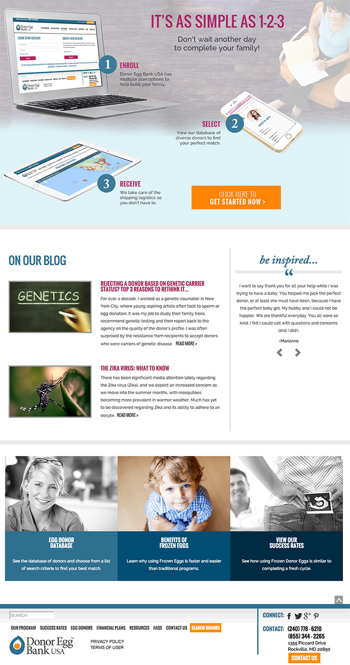
It’s great to see the wrap of a larger project. This project was one of our more complicated projects that was a year in the making. The client wanted a new, fresh site and needed a responsive site, one that fit all the devices for their high tech audience. I was able to start on redesigning the front-end right away but the back-end was a bit messy. Donor Egg Bank USA required a top-notch database that allowed for searching but also security to be rebuilt in the back end for the new site. My amazing freelance developers, Vasil & Filip accomplished this over months and the end project is done!
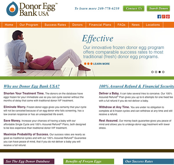
A year ago the site wasn’t responsive and looked like this:
 Old site
I kept the same logo but updated the brown to gray and brightened up the orange a tad. I actually tried to stick to the same colors, just brightened them a little and tried to give them a fresher, modern feel. I introduced a sans serif font and used a lot more photography. The redesign is very vertical so it’s easier to see in two images, or better yet, go to their site: https://donoreggbankusa.com


