A fun retro logo design that I think came out really well. Unfortunately, Atomidata had to close down, so if anyone is interested in repurposing this logo to their own needs, let me know!


A fun retro logo design that I think came out really well. Unfortunately, Atomidata had to close down, so if anyone is interested in repurposing this logo to their own needs, let me know!
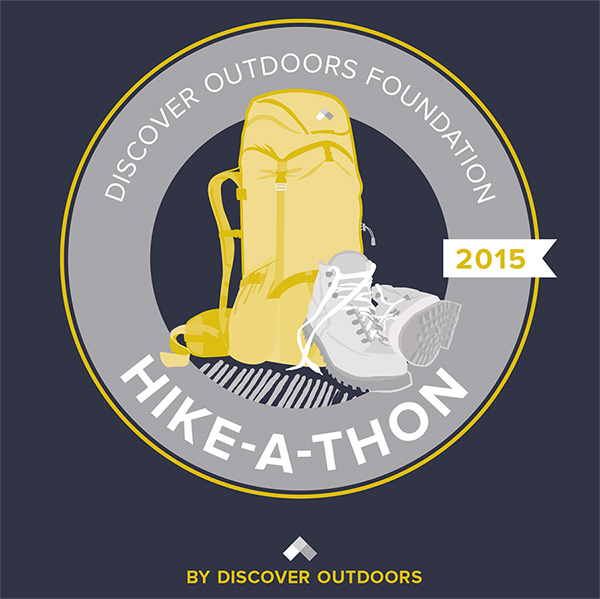
A great NYC-based group that brings outdoor adventures & educations to NYC kids – Discover Outdoors Foundation – needed a t-shirt designed for their first Hike-a-thon. The group was hiking 14 miles of the Appalachian Trail in Harriman State Park. It was a little challenging sticking to 3 inks, one being the client’s gray from branding, on a dark blue t-shirt color but I think it came out pretty well. Check out discoveroutdoors.com for more information about this great company.
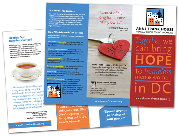
A tri-fold brochure for a non-profit in Washington DC providing housing to those in need.
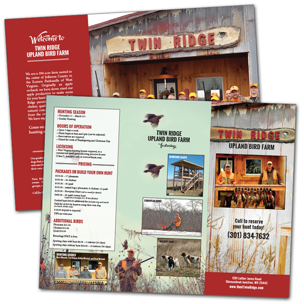
I got to refresh the design for the trifold brochure for the local Twin Ridge Upland Bird Farm. They had some newer photos to work with and the design highlights the photography and shares the pricing and basic information.
A 56 page program for an annual conference in DC for AAFA. This year’s theme was global and I wanted to have the brand colors stand out and clean type since there was a lot of copy throughout. I decided to make the presenter photos black and white this year to help with that and the client was ok with that decision.

Another local detailed logo. This logo will mainly be for the businesses truck wrap. Besaw was the client’s last name and he decided to use it to his advantage with a feisty bee holding a chainsaw for his firewood business. I tried to make it fun and colorful with a bit of local mountain vibe.
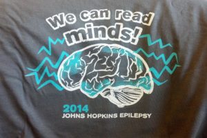
The Johns Hopkins Epilepsy group were looking for a t-shirt design for their nurses and doctors to wear. I came up with this design, a nice 2 color design to go on a dark gray shirt.
The Shepherd University’s Wellness Center started up a new competitive swim team for kids and teens this year and needed a new logo. During my research I discovered that the sea snake is actually quite deadly. I used Shepherd’s color scheme, Shepherd Wellness Center’s font tweaked just a little bit to be a tad prettier into the logo with ‘Sea Snakes’ and worked up a nifty logo for the new swim team to hopefully be proud of.
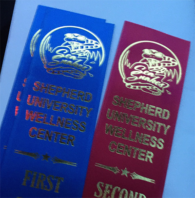
And as an update, the logo has been working out really well across various formats including spiffy ribbons as the team grows. Go Sea Snakes!
Discover Outdoors Foundation, in NYC, had the idea to do their first year’s annual report as a graphical representation instead of as a boring old booklet. I designed it bright, bold and included fun illustrations. It can be used as a web pop-up, a poster, a mailer, or be emailed as an attachment.

My son was having a birthday party and we made him a custom avatar based on Avatar: The Last Airbender for his birthday invitations. I pulled up a graphic from the show and a picture of my son in his uniform and designed this illustration.